Case Study: Fincheck
2017-2019 - Design Director and Primary Visual Design
Our Objective
In 2017, with user engagement at the forefront of Yodlee's company-wide objectives, my team and I were tasked with leading the concept and design of a new application to measure and track consumer financial health. Company leadership wanted a product that would encourage users to link all of their financial accounts by offering a comprehensive, easy to understand financial health assessment. Additionally, this application would need to generate mutually beneficial recommendations, provide users with actionable insights for improving financial health, and give the company the necessary customer data to target advertising of additional financial services and products.
My Role
As Design Director, I oversaw the development of the UI, user experience, and I contributed to the content. I assigned my Principle UX Designer to the project, and I worked with him to create user journeys and end-to-end flows. We worked collaboratively with a diverse cohort of peers on this project, including our UX Researcher, Principal Engineer, Senior Product Manager, and a member of our Data Science team.
The Initial Research
We began our research by partnering with the Financial Health Network (formerly CFSI) to gain insight into the market. Their studies provided valuable insight into our users' behavior and helped us build our personas. We then partnered with our data science team to run these personas against our aggregated data. The results enabled us to identify value ranges and other variables that aided our design. From there, we conducted surveys and interviews with potential users to define our scope. The final component of our research was a market analysis that identified the competition we would face in the marketplace.
User interviews conducted by Sarah Anderson
Competitive Analysis: Mint Turbo, Clarity Money and MX
Initial Design Explorations
Our initial design explorations consisted of daily, collaborative whiteboard sessions where we mapped out features, explored user personas, and hashed-out the overall scoring system for the app. Short user studies and preference tests guided our decision making. We built the first versions around a tablet layout for optimal large-screen visibility because we intended to showcase the app at several conferences.
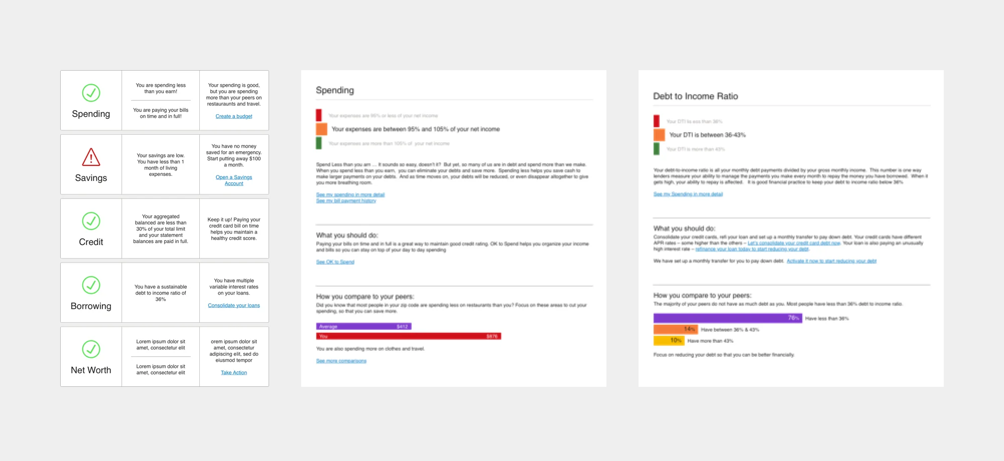
Early explorations for how to display indicator scores.
Low-fidelity studies to explore content and Hierarchy.
Early user journey by Tom Gulik
Best of Show at Finovate
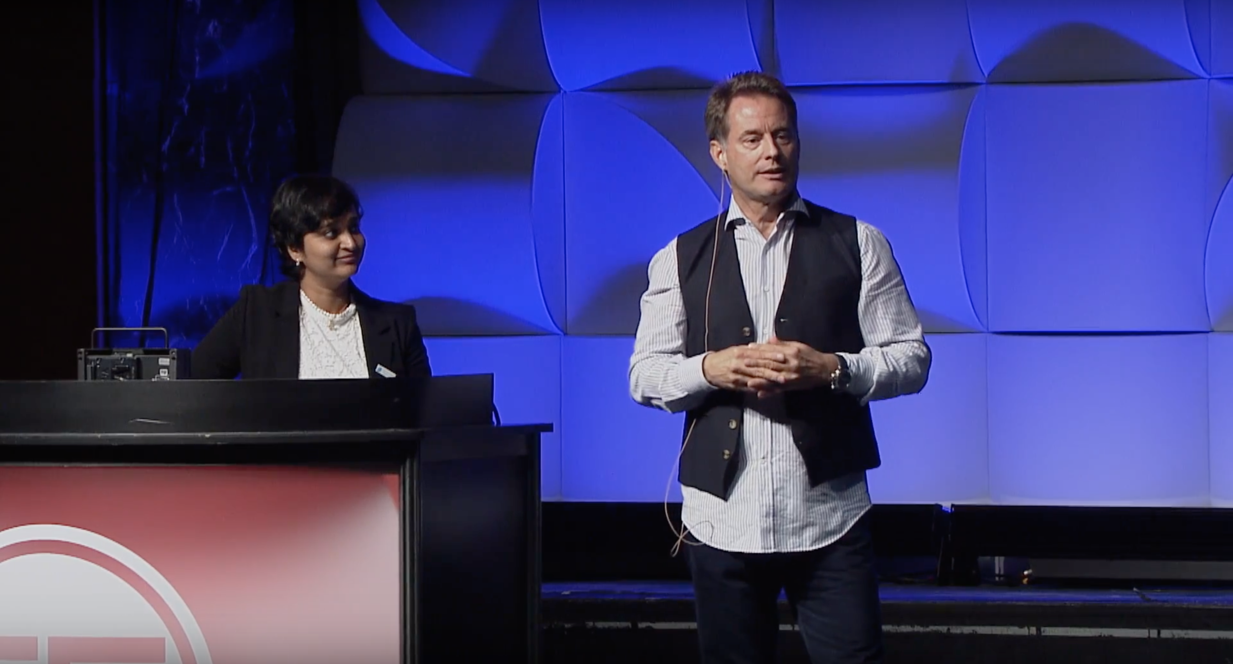
Finovate Fall 2017 was our first targeted ship date. I traveled to New York to coordinate our preparation and make sure the app was performing correctly for the event. Our Senior Vice President of Product presented the app on stage, and the attendees awarded us Best of Show. In addition to providing a significant boon to our sales team, this win validated our early design decisions.
Testing and Iterating
After Finovate, we worked with product and engineering to refine the scope as well as the interface. Led by discoveries from our user testing and feedback from early customers, we produced numerous iterations of the overview and indicator pages. Our unmoderated user tests helped us identify weaknesses in data discovery, which led to further overhauls of our content and layout. Brevity became our mantra as we paired down the amount of language on each screen and switched to a more conversational interface with each new version.
Evolution of the individual indicator pages. The final design is on the right.
Evolution of the overview page. The final design is on the right.
The final app flow including setup, settings and error pages.
Conclusion and Learnings
Our final product is an application that has a measurable impact on behavior and financial health. Our early testing and research set the tone for the project and allowed us to minimize mistakes. The product has successfully attracted new clients while increasing user engagement.
Data Visualizations and FinCheck Logo by Tom Gulik


