Enrich, 2019
Role: Design Director
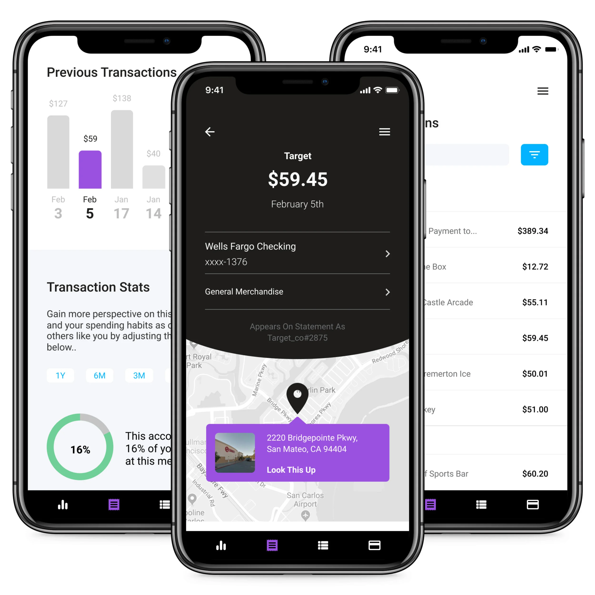
As Yodlee began to transition more of its product line to API solutions, I identified the need for a comprehensive sales tool that would demonstrate the full potential of Yodlee's data enrichment services. Enrich is my solution to this need. I developed the early concept, UX, and UI, and I successfully pitched it to internal stakeholders who immediately prioritized development. Enrich has already been integrated into Yodlee's sales presentations.
Glass Lewis, 2015
Role: UX and UI
I was contracted by Manifeste Marketing to do UX research and design as part of a larger rebranding for their client Glass Lewis. As part of this project I overhauled their existing information architecture, redesigned their content pages for increased accessibility, and reworked their homepage to better communicate their company identity.
Fincheck, 2017
Role: Design Director
Best of Show, Finovate Fall 2017
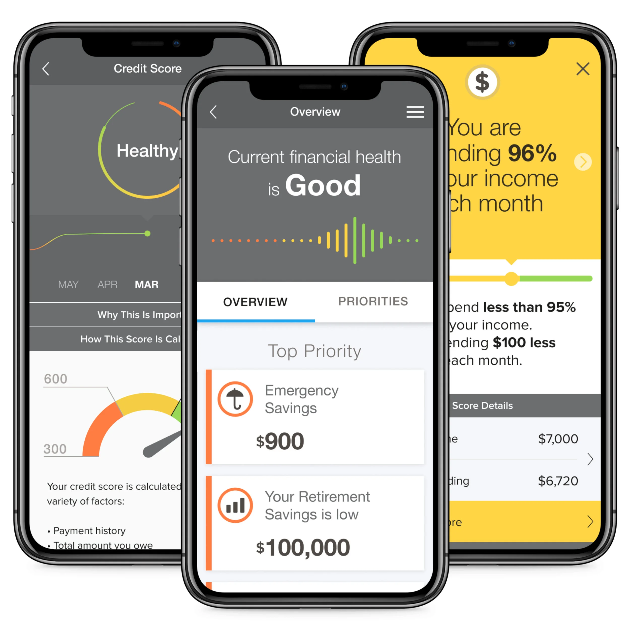
In 2017, with user engagement at the forefront of Yodlee's company-wide objectives, my team and I were tasked with leading the concept and design of a new application to measure and track consumer financial health. Company leadership wanted a product that would encourage users to link all of their financial accounts by offering a comprehensive, easy to understand financial health assessment. Additionally, this application would generate mutually beneficial recommendations, providing users with actionable insights for improving financial health, as well as providing the company with the necessary customer data to target advertising of additional financial services and products. My team's application won Best of Show at Finovate Fall 2017 and was later productized and deployed by several of Yodlee's largest clients.
Gyft, 2015-16
Role: Art Director
Gyft communicates with its customers via many digital platforms including e-mail, web and social media. I was regularly tasked with designing digital marketing campaigns that effectively promoted our business partners while also maintaining Gyft brand integrity.
Notification Center, 2018
Role: Design Director
Yodlee offers users a wide variety of products for personal financial management, and many users choose to use multiple of these products simultaneously to achieve their financial goals. Missing from this offering, however, was a centralized way to track all insights and notifications generated by Yodlee's products. My team was tasked with creating an app to meet this need.
One of the biggest challenges with this project was that the sheer volume of notifications had the potential to overwhelm users. To overcome this challenge, we kept the interface clean with soft colors and open line-heights to make content easy to read, and we included clear CTAs to empower users to quickly take action when necessary.
Our final design was met with enthusiasm and it is now in production for release to Yodlee customers in the coming quarters.
WTB, 2012
Role: UX and UI
In 2012 I was tasked with completely redesigning the WTB company website in order to update the overall look, feel and functionality of the site, implement updated branding standards and add more robust e-commerce capability. The previous website was discarded, and I designed the current site from scratch which included selecting a platform, optimizing information architecture and user experience, visual design, language localization and SEO. The redesign was well received by customers, and online sales tripled in the first twelve months immediately following the launch of the new site.
Yodlee Refresh, 2018-2019
Role: Design Director
Yodlee's Customer Care tool, a customer-facing support site, required updates to reduce the number of steps required to complete tasks and to improve the overall quality of the UI. Working with one of my senior designers, we systematically worked through numerous modules on the site, rethinking its functionality, navigation, and visual hierarchy to improve the user experience.
Gyft Enterprise, 2016
Role: UX and UI
In 2016 I was tasked with leading a complete redesign of the Gyft enterprise website. The purpose of this redesign was to make the site a much more powerful marketing tool by creating a visually stimulating website that effectively used modular architecture and lifestyle imagery.
Yodlee Refresh, 2019
Role: Design Director
Yodlee's core product suite encompassed nine different web apps, each focusing on a different area within online banking and finance. After five years with the same UI, my team was asked to give the product a new navigation paradigm as well as an overhaul to the critical visual elements on each page. We broke the apps into three categories to reduce the amount of information on the screen at one time. We also replaced a legacy top navigation system with simple side navigation to reduce the number of choices a user would need to contend with at any given time. Each dashboard widget was replicated as the hero graphic at the top of each app to reinforce the new visual language.